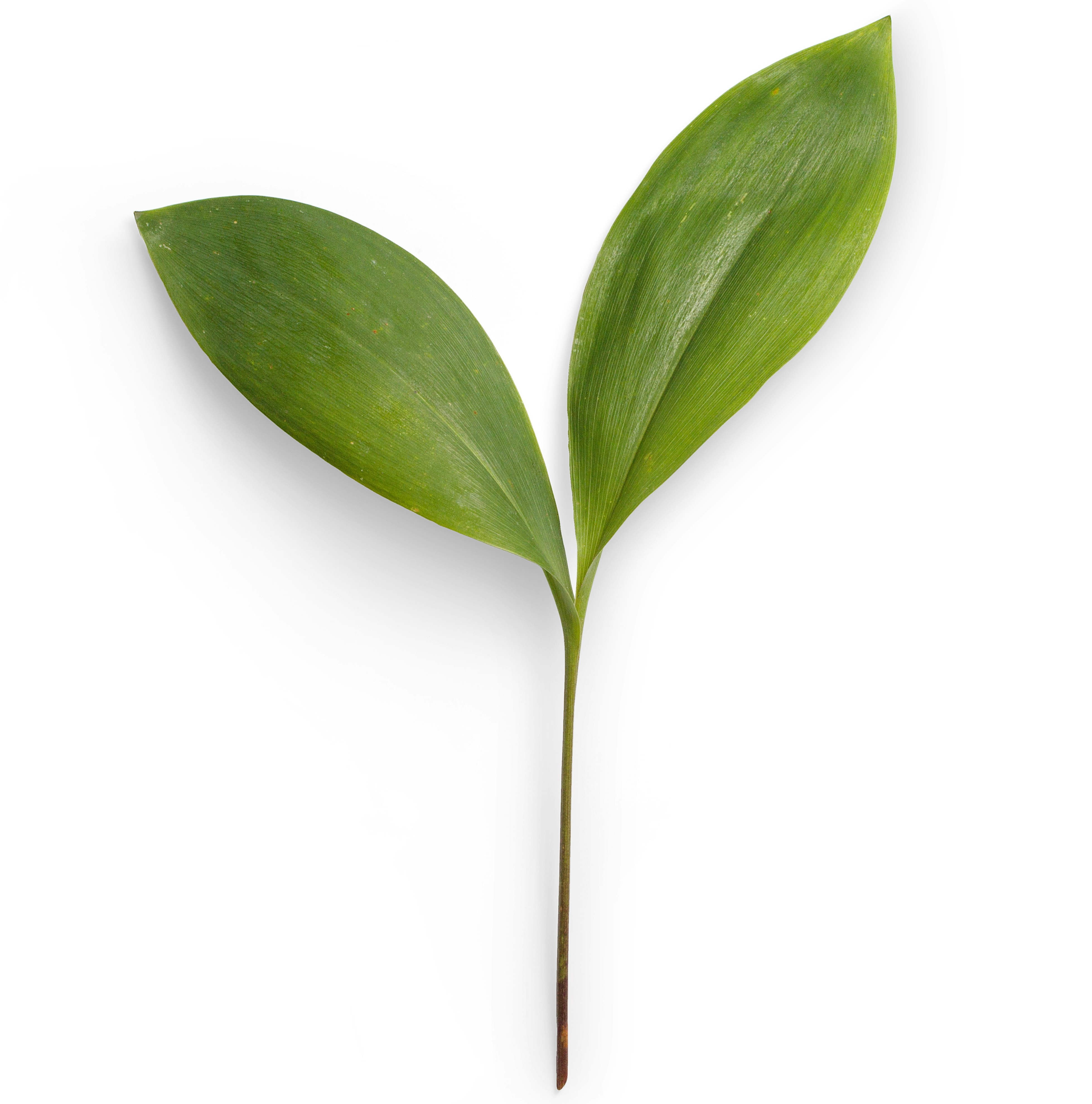
When I was working through Panel One, the main struggle I kept running into was making sure that the elements were aligned properly on the page. I had to make sure that both the image and the text below were centered on the page. I was able to center them by adding <img class="img-fluid mx-auto d-block">.
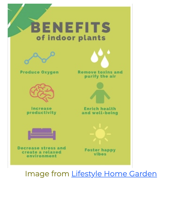
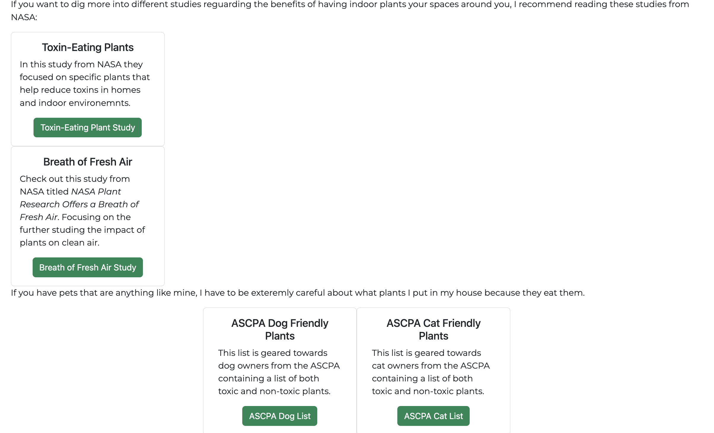
After adding the cards containging additional resources, I wanted them to be centered on the screen and have the text not run from edge to edge. I was able to use a grid to have them stacked in four rows breaking up the cards into rows of two and a sentence above the group to help define what the viewer is looking at.
Like you mentioned in you lecture, I found this section the easiest to complete because it was fairly straight forward. The only thing I struggled with was making sure that the fonts I pick were applied. As you can see in the picture only one of the fonts applied to the second panel.
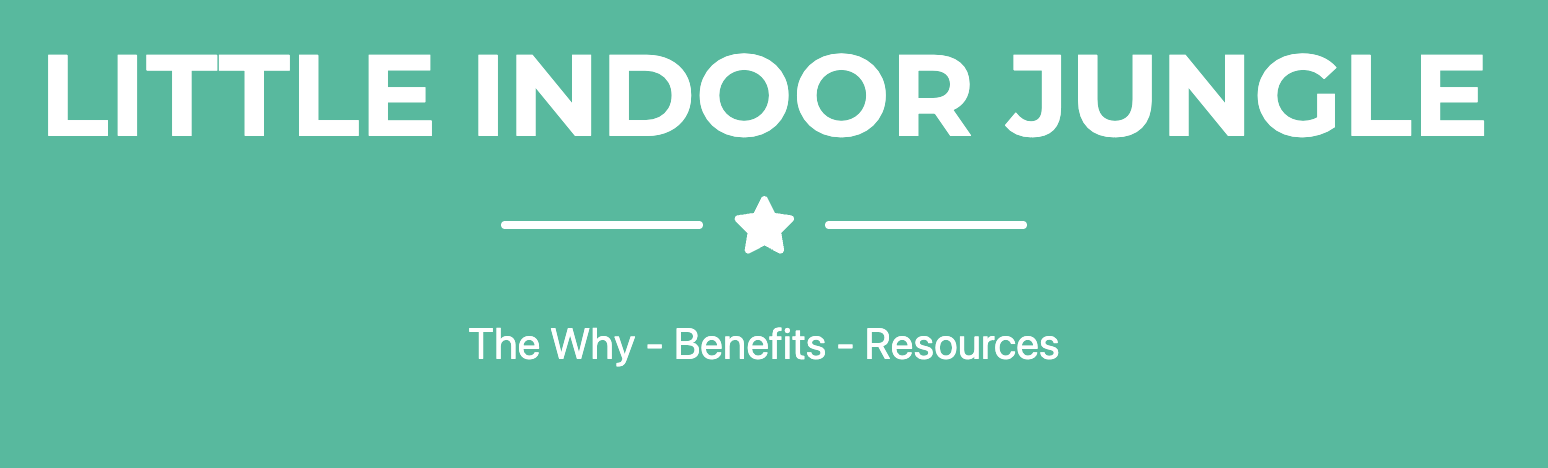
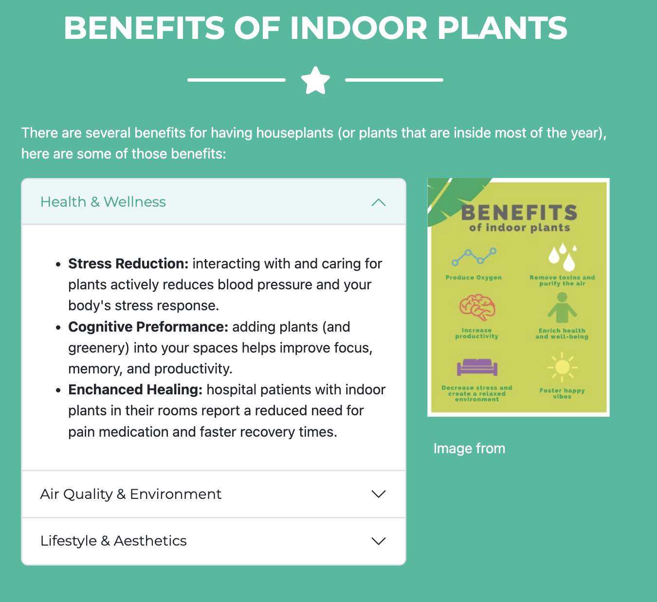
Another issue that I ran into is that when I transferred everything to Panel Two from Panel One, the < a href="..." > link disappeared on the screen due to the css styling. To solve this, I switched it out to a button link instead. (Also, after finishing I realized that the website I pulled the image from and created a link to was no longer working so I had to switch it which is why the image doesn't match.)
When I added everything into the theme on Panel Two, I didn't add the image to the Nav Bar and the accent font didn't originally carry over. In Panel Three, I was able to customize the Nav Bar to add a plant icon. I was also able to directly target where I wanted the accent font to show up at.

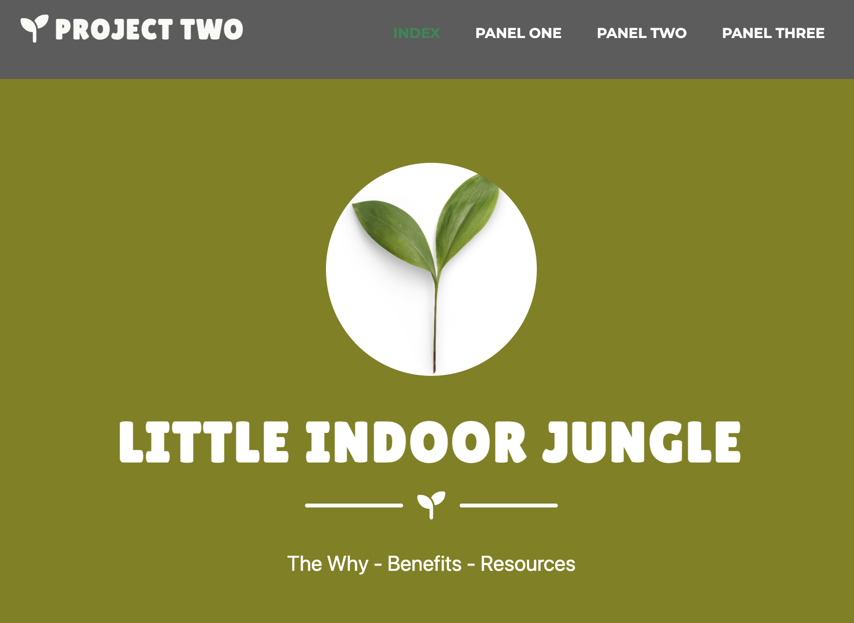
As I was adjusting the custom.css I realized that the more I added the olive green from the first panel, that I was not a big fan of the color. I wanted to keep in line with the plant content and use green. After playing around a little bit, I realized that I liked the <btn-success> green the best!
Honestly, for this project I am excited for how clean the design looks and how inviting it is to explore the webpage. If I had to pick two things that I am proud of, it would be the resource section and the accordion. The resource section contains four additional resource links related to the topic that are contained in cards and centered on the screen. I like how the accoridon section contains additional information and is able to be completely closed when not in use. Next time, I would love to learn how to be able to intergrate more than one font into a Bootstrap Template without a custom css.